PT
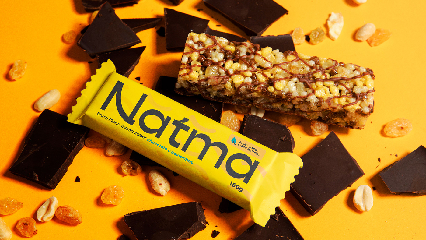
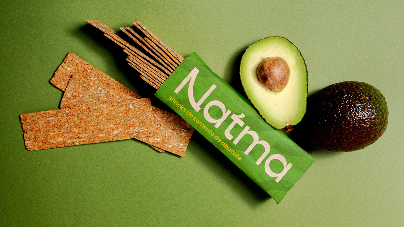
Natma é um movimento em direção a uma vida mais saudável através de uma marca com potencial para promover uma revolução afetiva baseada em pequenas mudanças nos hábitos diários. Nosso desafio era a transformação do corpo e da mente por meio da educação alimentar e outras formas de cuidado pessoal. A marca idealizada é elástica o suficiente para suportar tudo, desde uma plataforma digital que oferece aulas online, receitas e outros conteúdos sobre culinária e bem-estar, até um rótulo de produtos naturais dos mais diversos tipos.
O nome foi o ponto de partida para criar uma marca com consciência natural. Assim nasceu o neologismo Natma, que é uma mistura entre natureza, simbolizada pelo radical “nat” com “atma” – palavra sânscrita que significa alma e princípio de vida. Trouxemos então a combinação que deu origem ao nome que ressoa bem-estar e equilíbrio.
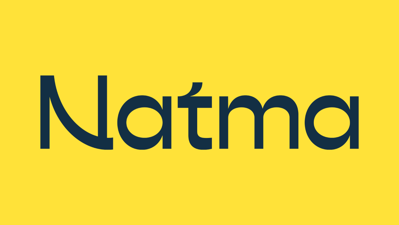
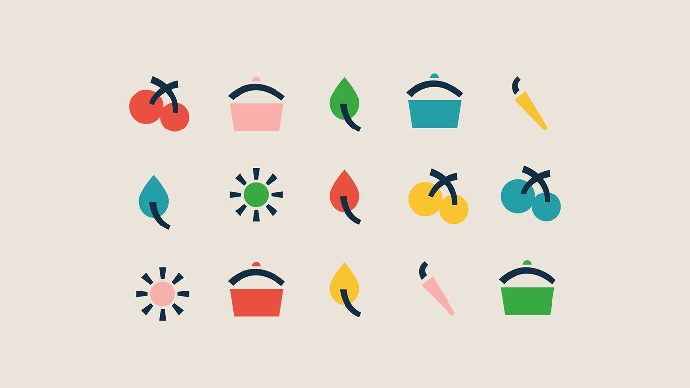
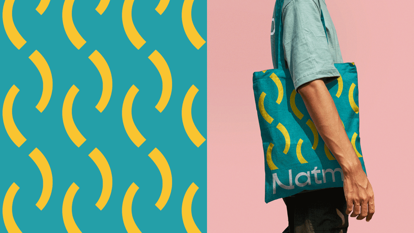
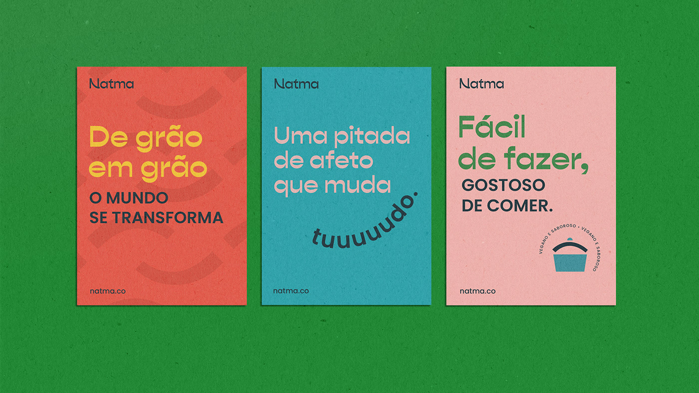
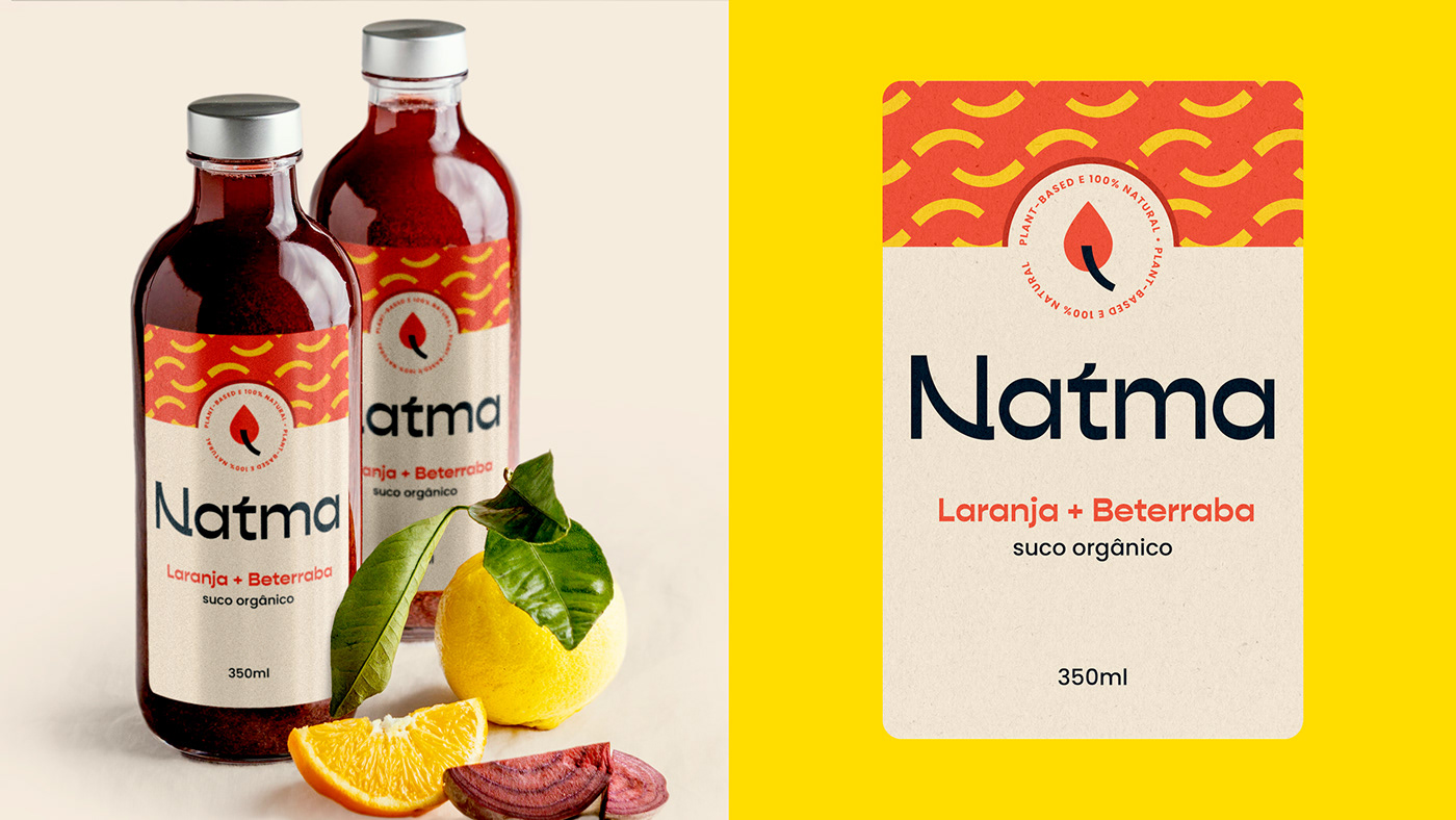
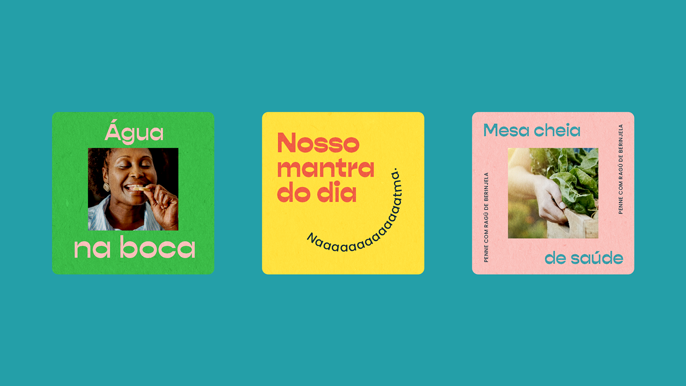
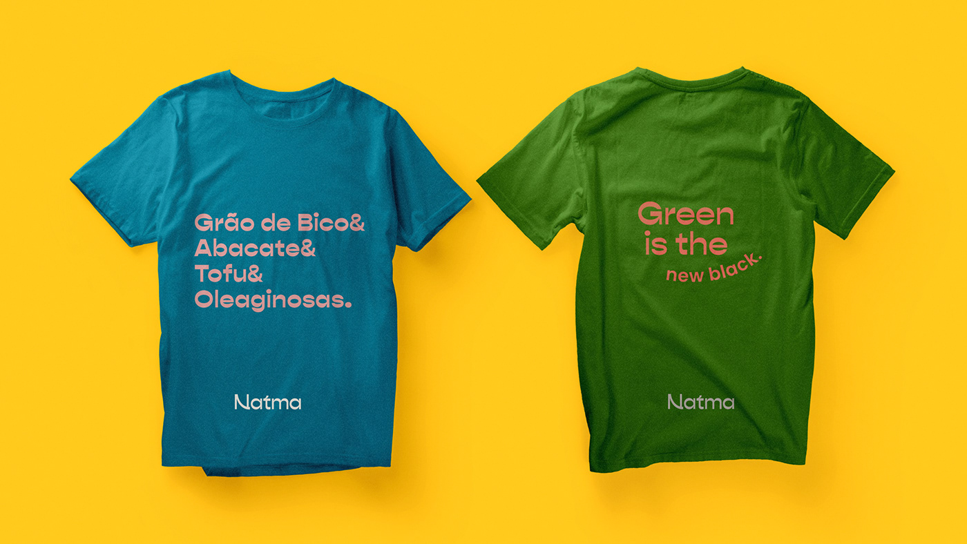
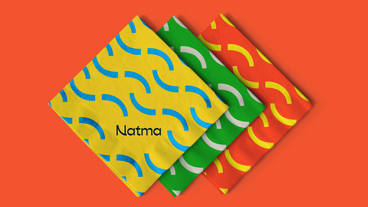
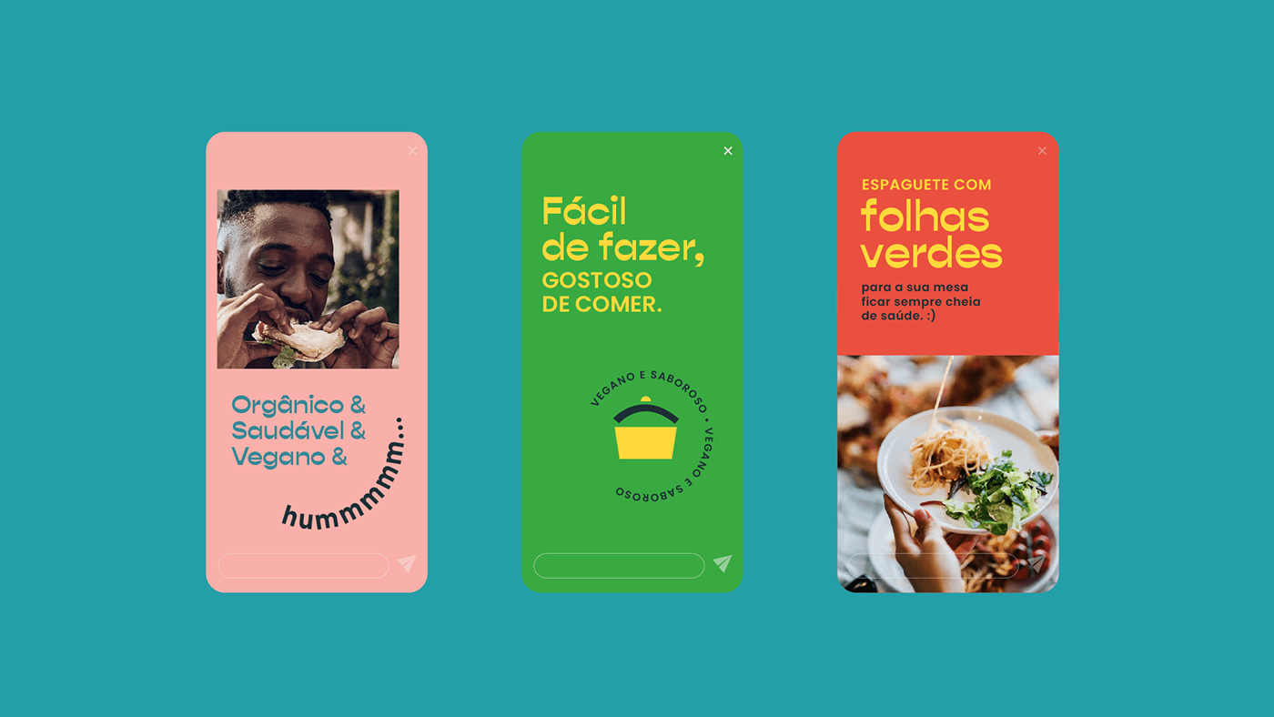
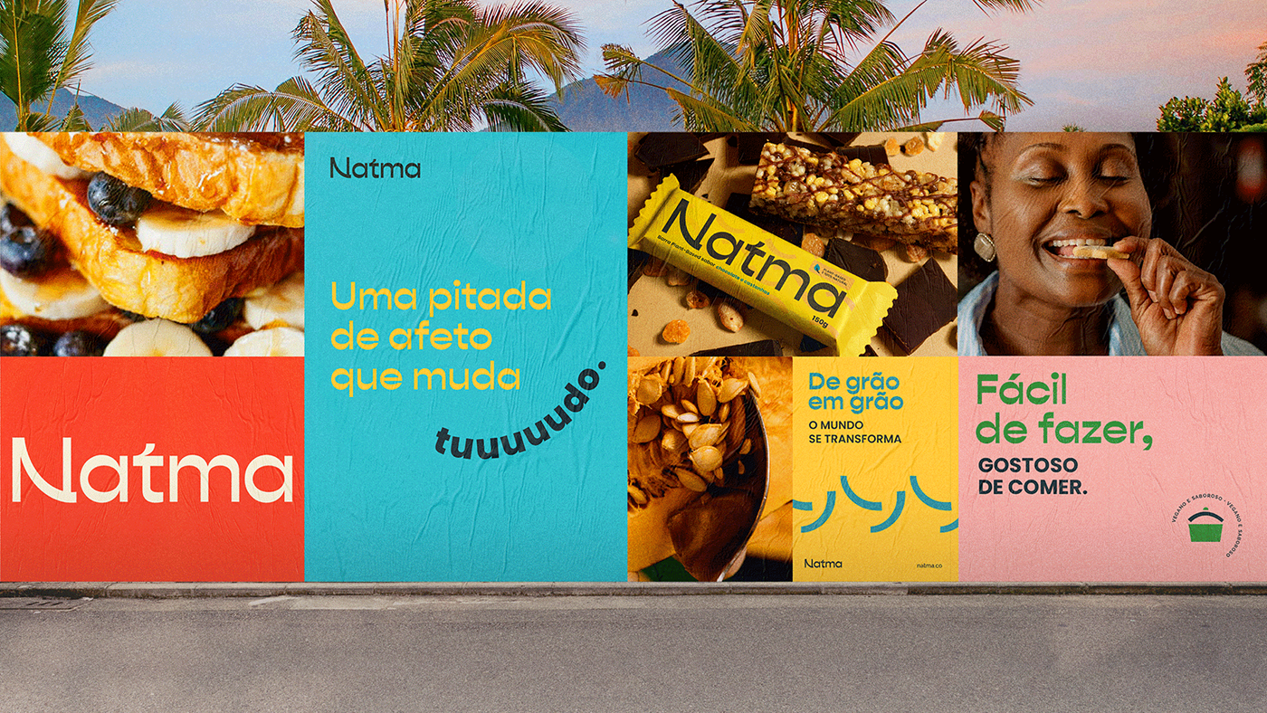
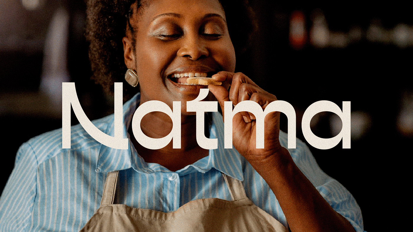
O logotipo da Natma, com suas formas orgânicas inspiradas em vínculos e raízes, remete à conexão que a marca faz entre as pessoas e uma vida mais natural. Também alude à escrita sânscrita, que inspirou a criação do nome. Selecionamos cores que remetem à natureza e ajudam a criar uma atmosfera orgânica, sem excessos e obviedade. Ícones e estampas com formas simplificadas e orgânicas compõem o universo visual, trazendo um aspecto artesanal, aliado a uma diretriz fotográfica com forte apelo em sabor e pessoas.
EN
Natma is a movement towards a healthier life through a brand with the potential to promote an affective revolution based on small changes in daily habits. Our challenge was to the transformation of body and mind through food education and other forms of personal care. The idealized brand should be elastic enough to support anything, from a digital platform that offers online classes, recipes, and other content about cooking and well-being, to a label of natural products of the most diverse types.
The name was the starting point to create a brand with natural awareness. Thus was born the neologism Natma, which is a mixture between nature, symbolized by the radical “nat” with “atma” - a Sanskrit word that means soul and life principle. We then brought the combination that gave birth to the name that resonates well-being and balance.
Natma's logo, with its organic forms inspired by bonds and roots, refers to the connection that the brand makes between people and a more natural life. It also alludes to the Sanskrit writing, which inspired the creation of the name. We selected colors that refer to nature and help create an organic atmosphere, without excesses and balanced. Icons and patterns with simplified and organic shapes make up the visual universe, bringing a handmade aspect, combined with a photographic guideline with a strong appeal in flavor and people.
Team:
Agency: iN Consultoria
Creative Direction: Caio Campana
Visual Identity: Carlos Teles
Verbal Identity and Naming: Marilia Antunes and Caio Ricciardi
Creative Direction: Caio Campana
Visual Identity: Carlos Teles
Verbal Identity and Naming: Marilia Antunes and Caio Ricciardi